




New York City can be a dangerous place. There are so many ways to get killed here just by not watching out where you're going.
Take, for example, the death map, illustrating where people had been fatally hit by cars or shot.
There's also an interactive crime map, that aggregates a variety of crime statistics to create a largely disturbing map of where, when, and how much major crime goes down in the City.
But with the long standing controversy of gun violence in America, a new interactive map is circulating that only shows injuries and deaths related to guns.
Have you ever thought, "Nobody's been shot near me, gun violence isn't a problem?"
If you're a New Yorker, and you think nobody's been shot near you, you're either very lucky, very oblivious, or very rich.
This map, generated by Slate andThe Trace using data from a non-partisan, non-profit called the Gun Violence Archive shows the startling truth about how much guns actually do hurt people.
The information showed on the map is from 2013, the latest year with available research. You can search anywhere in the country, and the results may be surprising.
Looking at only NYC, it's clear that portions of Brooklyn and the Bronx see more gun violence than the Wild West.
Contrarily, it appears that Queens isn't affected too badly by gun violence in comparison.
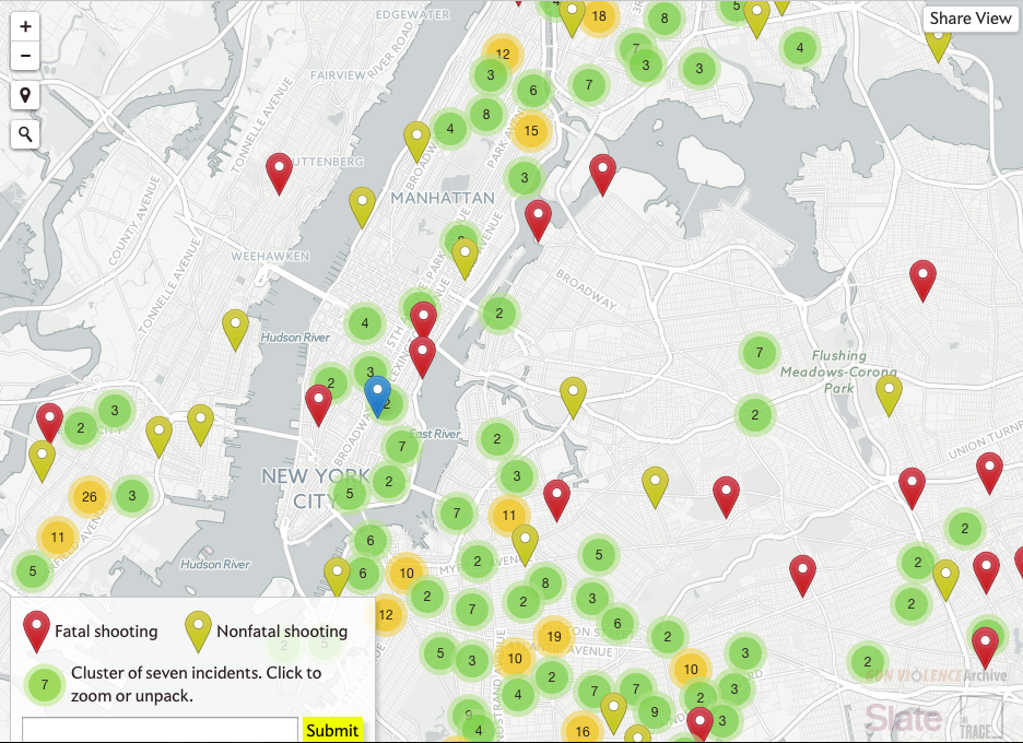
Screenshot via The Trace
While Midtown Manhattan sees relatively little gun violence, shots are fired at a disturbing rate uptown, as Harlem and the Bronx are heavily dotted fatal and nonfatal shootings.
If you're thinking about moving, or just curious about how crazy these streets can get, click over to The Trace and check it out.
Check out This Interactive Map of Christmas Tree Stands in NYC.
[via The Trace] [Feature Image Courtesy The Trace]