

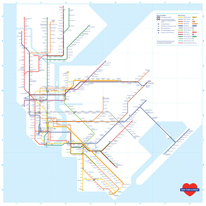
The New York City subway map has gotten a lot of fan overhauls in the attempts to make things either easier to read, to prove a point, or simply to make things more entertaining.
This map certainly falls into the latter category, as there's no value apart from intrigue.
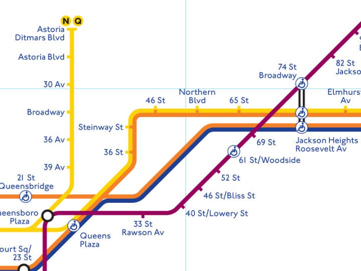
Graphic designer and transit map blogger, Cameron Booth drew the NYC subway map in the form of the London Tube, making things a lot more beautiful, but a lot less useful.
Booth, originally from Sydney, Australia, though now residing in Portland, Oregon, creates and re-creates maps in a thought-provoking manner, though many of them lose their functionality in the process.
However, he states that most of his transit maps are designed for fun, rather than for usability.
"The other thing to note is that- in true Tube Map style -service patterns generally aren't shown. This, of course, makes this map next to useless for actually navigating the subway- there's literally no distinction made on the map between the J and the Z for example- but that's the way things roll in London!"
Booth attempted to use colors similar to the lines we're familiar with, though altered them slightly to adhere to similar colors on London's Tube map.
Though we're not so sure we could actually use it, it does provide a better sense of the direction of each line without the clutter of the official subway map.
Regardless, we're fans.
[anad]
Check out What That Tiny Chinatown Shower-in-Kitchen Apartment Looks Like Now.
[via Curbed] [Feature Image Courtesy Curbed]