

In New York City, we take pride in our diversity. It thrills us that we're constantly surrounded by people from so many different backgrounds. It's part of what gives us so much character as a city.
So when we saw NYU's Furman Center's newly released map that shows where foreign-born New Yorkers live, we were pretty delighted.
The Furman Center's goal is to advance research and debate on housing, neighborhoods, and urban policy. This pretty map illustrating NYC's distribution of foreign-born New Yorkers helps.
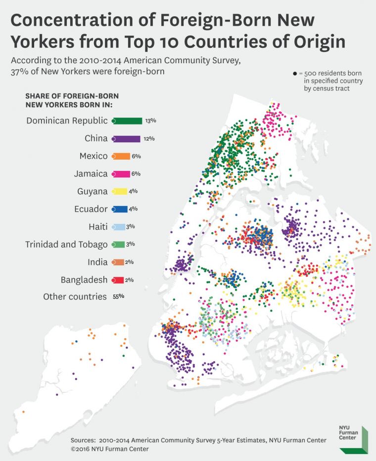
According to the 2010-2014 American Community Survey, 37% of New Yorkers are foreign-born.
Each dot on the map is a group of 500 people, and only the 10 countries with the largest representation in NYC are shown.
Of that 37%, 13% of foreign-born New Yorkers are from the Dominican Republic, 12% are from China, 6% are from Mexico, and 6% are from Jamaica.
As you can see from the map, the distribution of immigrants tends to be pretty uniform by neighborhood, except in vibrantly diverse Queens where the dots are beautifully mixed.
[anad]
Queens is home to plenty of immigrant groups, like New Yorkers from Jamaica, Guyana, Ecuador, India, and Bangladesh. Plus, of course, many other nations.
Is that why Queens has the best, most delicious assortment of cuisine hailing from cultures all over the globe? We're going to go with yes.
Anyway, you don't have to take our word for it. Check out the map below, and revel in the glorious heterogeneity of NYC.
Check out These Tiny, Incredibly Detailed Models of NYC.
[via UntappedCities] [Feature Image Courtesy NYU Furman Center]