




The New York City subway map is one thing that everyone struggles with from time to time.
Whether you're going somewhere new or just thinking about it, the subway map can be difficult-- especially for those out of towners who hover on the subway, desperately trying to figure out if they're lost or not.
But alas, there is help.
There have been a multitude of subway map versions floating around for years, despite the fact that there's only one official version posted everywhere by the MTA.
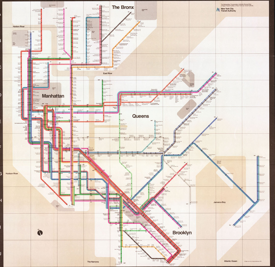
The latest of which is a redesign, by Tommi Moilanen, of Massimo Vignelli's well known 1972 map designed for the MTA that was later taken out of use. Moilanen mainly updated Vignelli's design to mirror what new stations we have built since the 70s.
So we're rounding up some of the more interesting versions of the subway map we all know. Which one looks the best to you? Are they any better or worse than what we've got now? You decide.
1. Massimo Vignelli
Massimo Vignelli / via Time Out NY
This is the relatively famous map by Vignelli. It was in use from 1972 to 1979. Though many around NYC loved it, lots of people complained that it didn't incorporate the character of the City and wasn't pretty enough.
Lots of people still think this is the best subway map there is, but nobody agrees on everything.
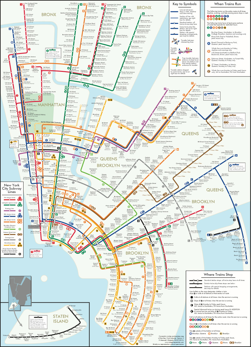
2. Max Roberts

Max Roberts / via Time Out NY
This rendering of the subway is very much in the style of Vignelli, but was actually done by Max Roberts. Roberts is responsible for multiple subway map concepts, ranging from very rational to definitely creative.
Above is Roberts' more traditional style, and below is his concentric circle design.
Max Roberts / via Time Out NY
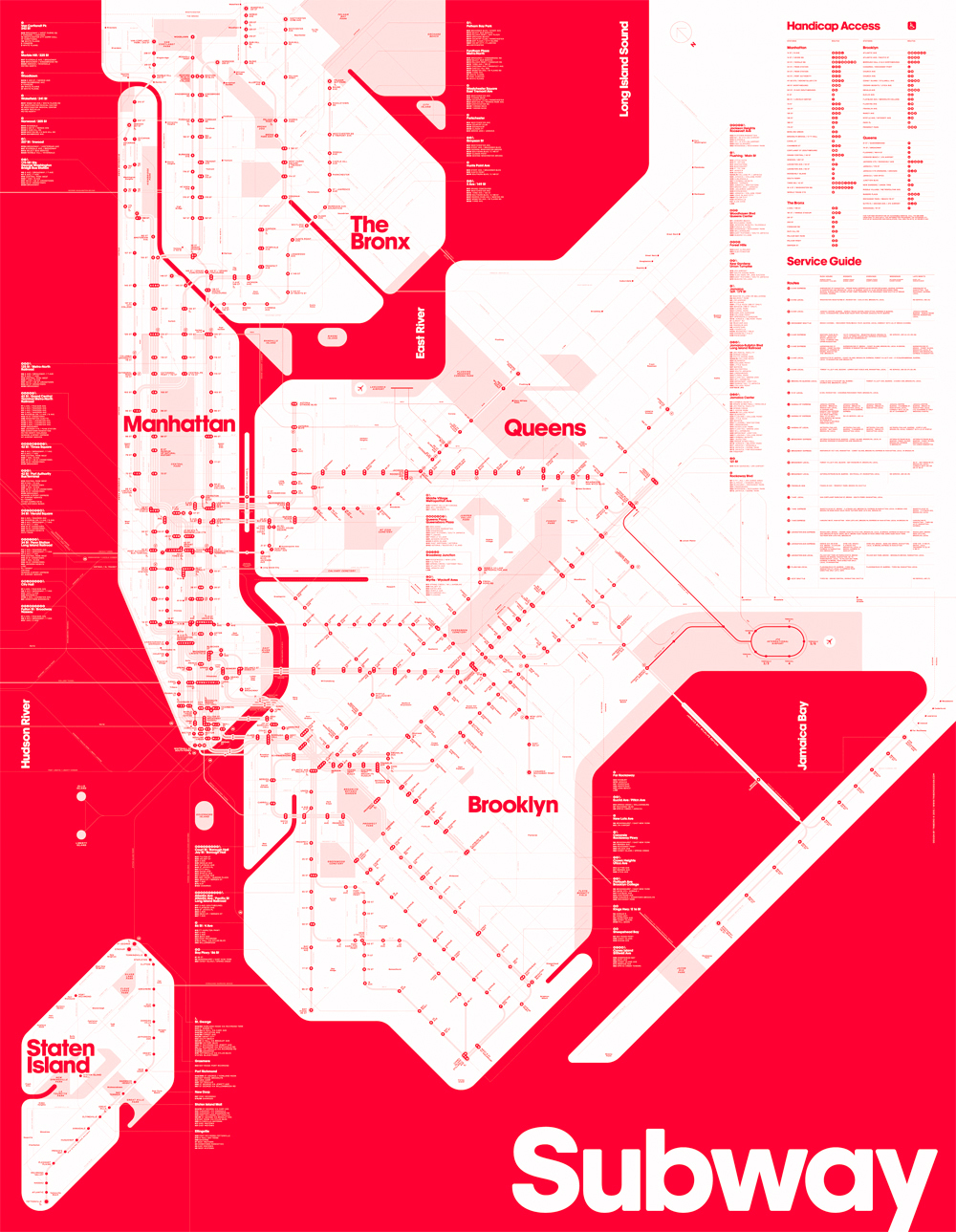
3. Stephanie Weigler and David Heasty
David Heasty and Stephanie Weigler / via Time Out NY
The concept from David Heasty and Stephanie Weigler works on color coding.
By just being two colors, the idea is that the human eye should be able to identify subway lines against the white-colored land areas more easily. What do you think?
4. Jug Cerovic

Jug Cerovic / via Time Out NY
Jug Cerovic's contemporary sleek design may take the cake for most rational layout while remaining easy to follow.
Not only that, it includes New Jersey and that's convenient for the countless people commuting into the City. Why should they use another map when NJ Transit links into the subway system in multiple ways?
Which map is the easiest to read for you?
Check out This Other Totally Redesigned, Easy-to-Read NYC Subway Map.
[via Time Out NY]